
Avidity Creative – Cedar Crest
Stone cold renderings to showcase Avidity Creative's brand design for Cedar Crest ice cream
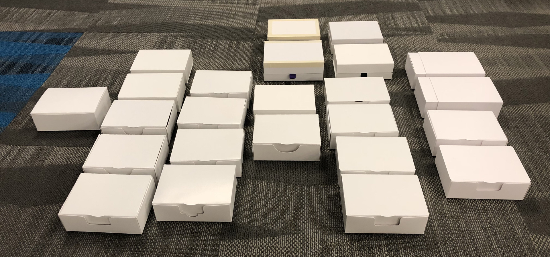
Avidity Creative hired pkgd.design to replace flat Photoshop mockups with photorealistic 3D renders of Cedar Crest’s refreshed ice-cream packaging.
The brief: custom “frosted” renders that look cold, craveable, and consistent across seven flavor SKUs — plus environmental scenes for web and social. Every asset had to be award-submission-ready and work double duty for Avidity’s portfolio and Cedar Crest’s marketing.
Problem
2D mockups couldn’t sell cold-surface realism, and they didn’t scale across SKUs and aspect ratios. Avidity needed a cohesive, photorealistic image library — paperboard tubs under studio lighting, tactile enough to anchor portfolio pages, award entries, and brand channels without a single re-shoot.
Outcome
Using SolidWorks for geometry fidelity and KeyShot for rendering, pkgd.design delivered a unified asset set: individual SKU renders with a believable frost treatment, plus environmental scene compositions in HD wide (desktop) and vertical (social) formats. The images replaced legacy mockups on Avidity’s site, supplied Cedar Crest with ready-to-publish visuals, and served as the image backbone for design-award submissions.


Ibrance – Pfizer Rx
Calendarized holistic packaging that guides breast-cancer patients through a complex dosing cycle
Ibrance® (palbociclib) is a potent CDK 4/6 inhibitor for HR-positive, HER2-negative metastatic breast cancer. To work safely, patients must follow a strict 21-days-on / 7-days-off schedule at one of three strengths (75 mg, 100 mg, 125 mg). Early in-market bottles left many women second-guessing whether today was an on day—or if they’d already taken a tablet. Workshop interviews in Manhattan confirmed the core pain: “I dump the bottle and count backwards to be sure.”
Pfizer charged Sam with leading the structural redesign from bottle to a holistic, wallet-card-plus-carton system that makes dosing intuitive—even for patients fatigued by chemo.
Problem
Patients lacked confidence. A bottle offered no visual cue for where they were in the cycle, leading to mis-dosing risks. Any new pack also had to:
- meet F=1 child-resistance (FDA) without frustrating older or neuropathic users;
- keep all three strengths visually distinct;
- integrate clear graphics from Pfizer’s partner agency without altering structural integrity.
Outcome
Within 24 months we moved from workshop sketch to market launch (2020):
- Three wallet cards per carton, each holding seven tablets.
- A circular, start-any-day blister pattern — patients align Monday–Sunday clockwise, eliminating calendar math.
- Design-patented blister geometry — US D889,280 & US D889,282, issued July 2020.
- Passed F=1 on the first test submission for 100 mg & 125 mg; 75 mg required one tweak due to round-tablet shape.
- Pfizer’s HCP materials now highlight the pack as a built-in “dose-tracking” aid.


ZYNcoin Comfy Can
Turning a throw‑away plastic canister into a pocket‑proud premium accessory
ZYNcoin wanted to give holders something real. Its in-house brand Get Comfy asked for a premium aluminum snus can — same size and capacity as the familiar plastic ZYN tin, good enough to show off, discreet enough for any pocket. And one more thing: hide a working bottle opener in the base.
Get Comfy brought the sketch to pkgd.design. The mission: turn it into supplier-ready CAD in under a week — and prove a fractional industrial design partner can outpace a traditional studio without cutting corners.
Problem
ZYN’s stock tin is injection-moulded plastic — cheap, light, made to be thrown away. Replacing it with CNC-machined aluminum raised three interlocking problems:
- Geometry paradox — the client wanted the bottle opener dead-centre on the can’s underside. Standard pry-bar openers need an exposed edge; a sealed disc has none.
- Capacity constraint — the can had to hold exactly 15 pouches. Nobody trades convenience for style.
- Weight and cost — aluminum feels premium, but every gram and every machining minute shows up in pocket weight and unit cost.
Miss any one of these and the product is a novelty — not flagship merchandise for a crypto-savvy audience.
Outcome
In five business days pkgd.design delivered two fully manufacturable versions:
- Debossed lid – streamlined feel, lower tool wear, and the lower projected unit cost of the two options.
- Embossed lid – mirrors the client’s original concept, adding modest extra mass and machining time.
Both variants matched the original plastic tin’s outer dimensions within ±0.05 mm, retained full 15‑pouch capacity, and arrived with STEP files, cutter‑path notes, and ISO‑dimensioned drawings any CNC shop could run immediately.

Challenges
Child-resistant yet senior-friendly
To earn an FDA F = 1 rating, the wallet had to defeat curious five-year-olds—but still open effortlessly for women whose grip strength may be weakened by chemotherapy or age. We iterated nearly a hundred cardstock prototypes, tweaking tab geometry, perforation depth, and push-through force until we struck that razor-thin balance of safety and usability.
Visual adherence—no electronics allowed
Regulatory and cost constraints ruled out smart caps or reminder apps. The package itself had to function as the adherence tool. That meant encoding the entire 21-days-on / 7-days-off cycle directly into structure and graphics so patients could see at a glance where they were—without doing calendar math or dumping tablets to count backwards.
Three strengths, zero mix-ups
Ibrance ships in 75 mg, 100 mg, and 125 mg doses. Each blister wallet had to make its strength unmistakable under harsh hospital lighting while staying visually cohesive as one brand system. Structural markers, die-line variations, and high-contrast graphics (developed with Pfizer’s agency partner) kept pharmacists and patients from grabbing the wrong strength.
Regulatory deadline race
Tablet chemistry was already in FDA review, and any structural delay could ripple into commercial launch. We ran parallel tracks—material validation, child-safety testing, and print-production trials—compressing what’s normally an 18-month loop into 12. Passing F = 1 on the very first submission preserved the timeline and avoided millions in potential write-offs.


Solution
Insight-driven circular layout
Linear “Day 1–7” strips (and off-the-shelf dose-packs) still force users to find the right starting cell. An industrial-design eye saw that a closed loop turns dosing into a visible journey: every pop moves clockwise toward a full circle, reinforcing progress and rest cycles.
Human-factors prototyping marathon
Using Illustrator dielines and rapid cardstock builds, we iterated roughly 100 combinations of push-through force, tab depth, and die-cut radii. The final spec hit the sweet spot: quick, low-effort access for adults while staying under the F=1 child-access threshold.
Evidence-based adherence framing
Meta-analyses show calendar blister packs boost adherence versus bottles (effect size 0.80). Pfizer’s own FAQ now echoes that benefit.
Open acknowledgment of trade-offs
Community forums reveal some legacy capsule users find push-through harder with neuropathy and dislike the extra material. We balanced those concerns by optimizing pop-force and minimizing board layers wherever F=1 allowed.


Result
Since its 2020 launch, the circular wallet has become the standard presentation for every Ibrance® strength, turning a once-confusing 28-day regimen into a daily ritual patients can trust. Oncology teams report markedly fewer “Did I take it?” calls, Pfizer’s own launch debrief praised the pack for reducing dose-timing questions, and rival CDK 4/6 therapies have begun adopting calendarized blisters of their own. By merging F = 1 child resistance with a UX-driven visual cycle, the new system empowers patients to see progress at a glance while meeting the highest safety bar—exactly what the bottle could never deliver.
“The circular wallet gave our patients confidence they were on the right day, every day.”
Impact
~100 prototypes built
Achieved F=1 on first submission
24 months launch timeline
Bottle → patented blister wallet
ES 0.80 adherence effect size
Calendarized blisters vs. bottles (published meta-analyses)
Need pharma-grade packaging design that marries F=1 safety with human-centered UX? Book a discovery call with pkgd.design.
see how pkgd.design is right for you.
Get a guided tour of our platform and process. All we need is 15 minutes to show you the magic of design as you want it, when you need it.